Sunday 1 October 2017

Eggs, Beans and Crumpets / Cocktail Time

It's been a while since I last posted on this blog. This has due to various factors, including pressure of other projects, existential ennui, and a feeling that no one has been reading this guff in the first place. However, a small flurry of very nice comments to various entries over the past couple of days has reminded me of my obligations. No, I don't mean obligations really - writing this really is fun!

So, let us proceed. Today, a couple of genuine classics.


This is Ionicus's 1971 cover for the short story collection Eggs, Beans and Crumpets (1940, though for some reason this Penguin edition says it was first published in 1951). These tales of the Drones Club and elsewhere are set in Linotype Times, looking like this:


There is an amazing wealth of detail in the cover here, from the crusty buffers in the foreground, through the exuberant figure of Bingo Little bursting in with an almost audible "Vo-de-o-de-o" in the middle distance (the waiter and the page boy equally startled by the apparition) and the corners of respectable old portraits appearing at the edges (when was the Drones Club founded, for heaven's sake?), and to the beautifully detailed perspective through the double doors and the corridor to the arched window at the end. The only issue I would now take with Ionicus is that the Drones on display are in general far too elderly and respectable. There is not one of them that I would trust to chuck bread at each other at mealtimes; not with accuracy, anyway. The Drones, as everyone knows, are a lighthearted bunch, but not here.

I suspect this matter may have been discussed with Ionicus, or he may have reached the same conclusion independently. At any rate, his 1987 cover for the Uncle Fred novel Cocktail Time (1958) makes ample amends:


Here the building may be the same, but the members are more of the age and disposition you would hope and expect. But the focus, as is right and proper, is on the central figure of Uncle Fred, the fifth Earl of Ickenham, about to wang a Brazil Nut at Sir Raymond Bastable's top hat via a catapult. The composition of this is gorgeous, with an attention to detail that Ionicus was, to be honest, not always showing in his covers of this period. The yellow waistcoat, matching his shoes, that combined with the natty white suit ensures Lord Ickenham is the centre of attention; the moment of dramatic tension on every face as he takes careful aim; the anticipation of the consequences of this frivolous and irresponsible act, which will reverberate through the entire novel; it's all there.

Oh, I haven't mentioned the typeface yet: let's repair the omission. It's Plantin, slightly more extrovert than the Linotype Times used above, using stars against the chapter numbers and a large initial letter to boot:


One final thing. I don't know the law, or even the unwritten rules, of cover design, but I confess to being rather taken aback by the use later illustrators have made of Ionicus's cover design:


The same yellow waistcoat (not mentioned in the book); the same attitude with catapult, same spatial relationship with the victim; oh, but I don't need to spell it all out, for you can see for yourselves. No previous cover design was anything like it, but now they all do it. I make no accusation, you know. I just mention it. 

Saturday 1 April 2017

Summer Lightning / Heavy Weather

Summer Lightning (1929) is undoubtedly one of Wodehouse's very best works. It's the third in the Blandings sequence, but is the first to feature Lord Emsworth's prize pig, Empress of Blandings (described as a black Berkshire sow, but usually depicted, as here, pink). Beach the butler (left) finds his role deepening, now not just a trusted servant but also a reluctant conspirator in the dirty deeds inseparable from a Wodehouse plot (in this case, pignapping). The Gamekeeper's Cottage in the West Wood, a key location in Leave It to Psmith (1923) reappears, and is the setting for the cover.

The novel was first published by Penguin in 1954, and the Ionicus cover dates from 1971. The font is Monotype Garamond, with the chapter titles in attractive italic:
Wodehouse went out of his way to be lyrical about Blandings in this novel. His descriptions of physical settings are usually brief and functional; but in Summer Lightning there are numerous pauses in the narrative to revel in the beauties of the setting, and without any obvious punch line. Take, for instance, the opening paragraph of Chapter 13: "Blandings Castle basked in the afterglow of a golden summer evening. Only a memory now was the storm which, two hours since, had raged with such violence through the parks, pleasure grounds and messuages. It had passed, leaving behind it peace and bird-song and a sunset of pink and green and orange and opal and amethyst. The air was cool and sweet, and the earth sent up a healing fragrance. Little stars were peeping down from a rain-washed sky." Wodehouse was making a special point, and the point was: don't you wish you were here?

I have a theory about this novel and its sequel, Heavy Weather (1933). The theory is this. PGW is associated with the era of the Twenties and Thirties, the era of jazz and flappers, Oxford Bags and Brideshead. The young generation was renowned to be fun-loving and outrageous. Wodehouse, who was in his forties and fifties during this time, seems to have responded by wishing to remind a few people that earlier times had also featured outrageous revels; and so he invented the Hon Galahad Threepwood, reprobate younger brother to Lord Emsworth, who, now in his fifties, is busy writing scandalous Reminiscences of his life when he was young and riotous in the 1890s - and of the lives of his contemporaries, now old and respectable, who will do almost anything to suppress anecdotes of a phase in their lives that they thought was dead and buried. Wodehouse plots all tend to the same pattern, but here he found something like a new pattern, a brilliant pattern with deeper implications than we usually expect in his work. Landowners, noblemen, prospective Conservative politicians, all are in terror of the facts that may be laid bare in the Reminiscences. The sight of respectability in a panic is always funny and strangely satisfying. The fact that the instigator of all this is a dapper little man in his fifties with and eyeglass and absolutely no respect for anyone makes it all the funnier.

Here is the Ionicus cover for Heavy Weather:
Not quite as stylish as the Summer Lightning cover, but it has its points. We are in the small library of Blanding Castle, with photos of the Empress on the bookcase. It's a working study for Galahad (seated), who is about to put his manuscript of the Reminiscences into the top right hand drawer of the desk (the scene is on page 97 of this edition) while his erstwhile publisher, the mogul Stinker Pyke (I beg your pardon, Lord Tilbury) looks on. We look on from a rather Hitchcockian aerial view, appropriate to the intrigue of the plot, centring on stealing the manuscript from that very same desk drawer. Ionicus has decided not to draw the floor or walls, which gives the scene a strange, floaty feel which is presumably not intended. (I have just noticed the Hon Galahad's bright yellow socks, which match is waistcoat: perfect!)

The font here is Monotype Times: more sober than its predecessor's Monotype Garamond:
I don't know if Wodehouse always had it in his mind to write a sequel to Summer Lightning, but that is what Heavy Weather is: a direct continuation of the plot of the previous offering. At the end of Summer Lightning (spoiler alert), a deal had been arranged in the Threepwood family to allow young Ronnie Fish to marry chorus girl Sue Brown, on the understanding that in return Galahad would not publish his book. Wodehouse must have started wondering at some point about some of the loose ends, specifically: 1. what happens when his publisher finds out that he's backing out?; and 2. what happens when Ronnie Fish's mother learns of the deal that has been struck? Cue renewed machinations, with Respectability in full attack mode against love and wit.

There are some surprisingly forthright lines in both books in criticism of the Downton Abbey milieu which we are supposed to take so reverently in these days; as when Ronnie Fish valiantly suggests earning his living (at the end of Summer Lightning):

" 'The market value of any member of this family,' said the Hon. Galahad, who harboured no illusions about his nearest and dearest, 'is about threepence-ha'penny per annum.' "

Oh, and before I finish.... I have an omnibus volume of Something Fresh, Summer Lightning and Heavy Weather, confusingly called Life at Blandings, like the box set I have featured previously. It uses the Ionicus illustration for Summer Lightning:

It was while perusing this volume that I noticed an odd thing about the opening sentence of each of its constituent novels. Thus:

"The sunshine of a fair Spring morning fell graciously upon London town." (Something Fresh)

"Blandings Castle slept in the sunshine." (Summer Lightning)

"Sunshine pierced the haze that enveloped London." (Heavy Weather)

Of course, it doesn't work for all the novels. But it must be admitted that having sunshine right at the start of a Wodehouse novel is somehow exactly right.


Sunday 12 March 2017

Indiscretions of Archie / The Adventures of Sally

Indiscretions of Archie (1921) - the title, despite all instinct, has no "The" - is a series of loosely connected short stories, set in New York and featuring a sterling example of the Wodehouse patent nice-but-dim English hero: Archie Moffam, pronounced Moom, newly wedded to Lucille Brewster, daughter of hotel tycoon Daniel Brewster. I can't remember if D. Brewster is said to be dyspeptic, but frankly Archie Moffam as a son-in-law would make anyone so.

So here is Ionicus's cover for the Penguin edition, created for the 1975 reprint. I would call this a good-bad cover. The actual design is very effective: seven figures, all very well done, the spread of rubbish on the ground suggesting a back alley rather effectively without the trouble of depicting it; in the middle, a fiery character about to poke the snoot of the ineffectual gent on the left. The man in the middle, so the passing book-buyer would assume, must be the indiscreet Archie. His position on the cover certainly places him as the hero, as well as the matching of his red hair with the red author banner across the top. Only, of course, he isn't: Archie is the ineffectual snoot-pokee. Archie is the kind of person to whom things happen; a sort of Bertie with no Jeeves, but with the very occasional flash of intelligence. The snoot-poker is actually supposed to be a baseball pitcher by the name of Looney Biddle, into whose affairs Archie has, for the very best motives, been interesting himself, with the worst results. I'm not sure what the baseball player in the background is supposed to be, as there is no other distinct baseball character in the book.

The font is Intertype Garamond, thusly:


I like the layout of chapter headings: just the right air of the old-fashioned.

Archie Moffam is supposed to have fought in the Great War. I find this aspect of the book unconvincing in the extreme. His character is too soft and naïve to match a first hand experience of that conflict. Wodehouse seems to have felt the same. Anyhow, he never repeated the idea.

The Adventures of Sally (1922) had its first Penguin publication in 1986, with this cover:


Another red-headed hero; but more civilised, this time. I like the chiming of the green seats with the green above the picture. Archie was farcical in tone, buy Sally is more romantic, with some rather perfunctory mishaps and misunderstandings between Sally, Ginger, and their happy ending. Ionicus is beginning to go off the boil a little, I fear; there's a similar underpowered note as in the Damsel in Distress cover - rather as if his heart were not in it. Here, as with Archie, the ground/floor is left completely blank. Perhaps he found floors too dull, or difficult. He could do them, but he did have a tendency to leave them out whenever he felt he could.

Here's the opening, in Baskerville:

There's nothing actually wrong with this, but the small capitals for the chapter title seem somehow over-fussy.

These books of the early twenties suffer from being of Wodehouse's transitional period. He's still trying out different types of story, some of them more effectively than others. He had yet to settle on his perfect blend of farce and romance. It's a little frustrating - he had already started writing his stories of Jeeves and Bertie - but after all, he had to find his own way.

Sunday 19 February 2017

Something Fresh / A Damsel in Distress

I've been, for no good reason, neglecting the Blandings series so far - certainly as compared to the Jeeves books. This is odd, because I have a tremendous affection for Blandings Castle and its denizens (though I do feel the series ran out of fuel rather badly after Uncle Fred in the Springtime (1939). At any rate, as a first step towards rectifying matters, here is the first in the series, Something Fresh (1915).
Strangely enough, this title was not published by Penguin until 1979. The Ionicus illustration therefore dates from that year. The book was made and printed in Great Britain by Richard Clay (the Chaucer Press), and the type is Monotype Times. The orange spine has a tendency to fade, and I know from a previous copy of mine that the gum in the spine will crack, shedding pages, given half a chance. I'm therefore taking care with this present copy. The type is very no-nonsense, and looks like this:
Something Fresh (in the U.S., Something New) really is something fresh. The first Blandings novel, it is also, in my opinion, one of the best. Later Wodehouse was, as we know, 95% formula (and none the worse for it) but in these early days PGW was still striking out, exploring stories, themes and ideas for the first time. The hero, Ashe Marson, is a jobbing writer of detective stories (I sometimes feel I wouldn't mind reading a few of his Gridley Quayle shockers) who, for reasons which, as usual, are too complicated to explain here, travels to Blandings Castle in the guise of manservant to dyspeptic mogul J. Preston Peters (no Wodehouse plot is truly complete without a dyspeptic mogul). Some of the strongest and most original scenes come from Ashe's initiation into the complex social rituals of the servants at a large country house. I am convinced that Julian Fellowes must have drawn rather largely on Something Fresh for his picture of the world of the servants in both Gosforth Park and Downton Abbey. The tone is, of course, light, but we don't yet achieve the delirious farce of later titles, and Lord Emsworth has not yet acquired that pearl of sows, Empress of Blandings.

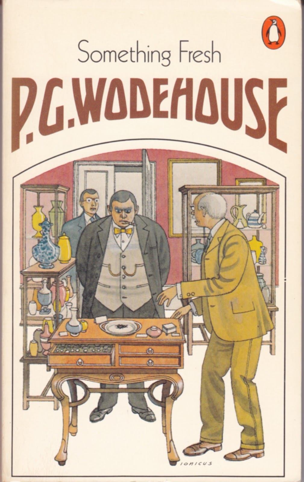
The Ionicus scene is well chosen, showing Lord Emsworth (right), Mr Peters (centre) and the Efficient Baxter (left, back), as well as the object which is the motor of the entire plot, a Cheops Scarab of the Fourth Dynasty, pinched and re-pinched by the characters for their own ends until happiness can be achieved. The scene takes place in the cluttered museum room at the Castle, giving Ionicus plenty of opportunity to draw the furniture and other decorations that he so enjoyed. The figures are well depicted too, every character clear and correct. However, as sometimes happened he appears to have given up at the thought of doing the floor.

I'm taking this opportunity to include A Damsel in Distress (1919) as well, a less successful cover but still worthy of coverage in this ongoing survey:
This book was first published by Penguin in 1961, being reprinted in 1987 with the Ionicus cover. The type, dating from the 1960s version, is in Monotype Garamond:
The more fancy styling of "Chapter 1" is a clear token of the older typesetting.

A Damsel in Distress feels similar to the Blandings series, though it is not one of them, as the characters have different names and the setting is Hampshire, not the more northerly Shropshire. I seem to remember Wodehouse later saying that he regretted settling on Blandings for the series, as it was so remote from London - though that is part of its charm. (By the way: yes, this book was indeed the source for the later Gershwin/Astaire film of the same name.)

I was struck, on rereading Damsel a couple of months ago, by an odd thing. It is quite apparent that this book about England, written by an Englishman (indeed, the quintessential Englishman) is nevertheless rather American in tone. I'm aware that Wodehouse deliberately developed his style as a way of portraying England for Americans, but I don't think I have ever been so aware of this fact as I was in rereading this book.

For example, at the beginning of Chapter Two Wodehouse is describing a side street in the West End of London, and this is what he writes as narrator: "Cats washed themselves on doorsteps, preparatory to looking in for lunch at one of the numerous garbage cans which dotted the sidewalk." Garbage cans rather than dustbins, sidewalk and not pavement? PGW could hardly have made the point clearer.

The hero, George Bevan, is an American composer over in England to see his latest show through its West End production. Naturally, he falls in love, and follows the lady to her country retreat at Belpher Castle, Hants. This is how, in Chapter 7, Wodehouse describes the village in which George finds himself, and while the American references make greater sense now that we are viewing things from George's point of view, they're also clearly for the benefit of the American reader: "It is to be questioned whether in the whole length and breadth of the world there is a more admirable spot for a man in love to pass a day or two than the typical English village. The Rocky Mountains, that traditional stamping-ground for the heart-broken, may be well enough in their way; but a lover has to be cast in a pretty stern mould to be able to be introspective when at any moment he may meet an annoyed cinnamon bear. In the English village there are no such obstacles to meditation. It combines the comforts of civilization with the restfulness of solitude in a manner equalled by no other spot except the New York Public Library."

Ionicus sometimes had a weakness for depicting scenes from very near the end of a book, and indeed containing what we would now consider serious "spoilers". This is one of those illustrations. It is, without going into detail, the moment when the scales finally fall from the eyes of the heroine, paving the way for happy endings all round. The ill-favoured bounder on the right is a young solicitor passing over a summons for Breach of Promise, and doesn't really deserve the honour of being on the cover. Well, never mind.

Sunday 15 January 2017

Psmith Journalist

The history of Psmith Journalist is a little more complicated than might be anticipated. It was first published in volume form in 1915. However, it was originally serialised in the boys' paper The Captain as far back as 1909-10. I don't know why it took so long to achieve separate publication. It's a strong book, very different from what we might expect from PGW in that it deals relatively seriously and factually with the gangs of early 20th century New York - though it is true that this basic setup is farcically disrupted by the intervention of the unruffleable Psmith.

As I've mentioned before, Ionicus seemed to take especial pleasure in the Psmith covers. Here, the shabby offices of the paper Cosy Moments are beautifully evoked, with a glimpse of old New York visible through the window. Psmith is immaculate as ever, but, leaning against a filing cabinet, seems completely at home - as he is in every place. Behind the desk is the firebrand editor Billy Windsor, and on the other side is a certain Francis Parker, a sleek and immaculate young man who is however the mouthpiece for much nastier forces. This is a very carefully composed cover, in the balance of figures, the colours, and the detail in every corner of it. One of the very best. This title was first published in Penguin in 1970, and I would say the Ionicus cover dates from then.

Here's the first page of the book - Wodehouse's Preface in which he assures readers that the events described have a strong basis in reality. The font is Intertype Times, and the book was printed, appropriately enough, in the USA - Harrisonburg, Virginia.

The tale concerns an inoffensive little journal for the home, called Cosy Moments. When the editor goes off on holiday for the good of his health, it is left in the hands of an ambitious and frustrated young man from Wyoming, Billy Windsor. With Psmith's encouragement, he turns the paper into a sensational and crusading anti-corruption sheet.

For the most part, Psmith treats the whole thing as a game. However, there is one aspect which he treats very seriously. In one episode, he stumbles upon a thoroughfare called Pleasant Street, a place of horrific slum tenements. Having investigated what they are like, Psmith decides as follows:

"I propose... to make things as warm for the owner of this place as I jolly well know how. What he wants, of course... is disembowelling. I fancy, however, that a mawkishly sentimental legislature will prevent our performing that national service. We must endeavour to do what we can by means of kindly criticisms in the paper."

It is this crusade which leads to attacks on the paper by the gangs of New York. After some digging they discover that the owner of the tenements is as certain Stewart Waring, "one of the biggest men in New York", who happens to be running for the post of City Alderman. Waring had previously been Commissioner of Buildings, but had to resign when a music hall built under his watch collapsed on the third night due to its poor construction, "killing half the audience." That was five years ago, however, and it has since been put about that he is a reformed character. "The other papers said it was a shame, hounding a man who was sorry for the past and who was trying to make good now.... He's been shooting off a lot of hot air lately abut philanthropy and so on. Not that he has actually done a thing - not so much as given a supper to a dozen news-boys; but he's talked, and talk gets over if you keep it up long enough."

Anyway, finally the man Waring is against the ropes, worsted, of course, by the fiery Billy Windsor and the debonair Psmith. They have the proof that could break him. What, Waring asks, will they do? Psmith replies:

"The right plan would be to put the complete kybosh (if I may use the expression) on your chances of becoming an alderman. On the other hand, I have been studying the papers of late, and it seems to me that it doesn't much matter who gets elected. Of course the opposition papers may have allowed their zeal to run away with them, but even assuming that to be the case, the other candidates appear to be a pretty fair consignment of blighters. If I were a native of New York, perhaps I might take a more fervid interest in the matter, but as I am merely passing through your beautiful little city, it doesn't seem to me to make any very substantial difference who gets in. To be absolutely candid... If the People are chumps enough to elect you, then they deserve you."

So he allows Waring to run for Alderman without exposing his nastiness; but Psmith does insist that Pleasant Street is renovated completely and made fit for human habitation. A practical solution, and studiously unpolitical in the narrow sense of the word.

For Wodehouse, this is almost angry; very nearly a serious political statement. I can't immediately think of another instance. For that alone, mark it well.

Monday 2 January 2017

Pearls, Girls and Monty Bodkin

I will admit frankly that the only reason I'm choosing to feature this book at this time is that the cover seems so appropriate to the festive season. Pearls, Girls and Monty Bodkin is late period Wodehouse, first published in 1972 when he was over ninety years old. It forms the third part of what one might loosely call the Monty Bodkin Trilogy, the other two books being Heavy Weather (1933) and The Luck of the Bodkins (1935).

It's difficult to think what might have spurred PGW to continue this saga in the 1970s after such a long hiatus. Clearly, he felt the story had not been satisfactorily concluded in the previous instalment. As happened in the cases of other long-running sagas (the Fink-Nottle/Bassett romance springs to mind) he took a late decision to change the formula. Here, Monty Bodkin, long-term beau of the formidable Gertrude Butterwick, changes his mind. The way to happiness is complicated by the requirement to keep in the good books of dim but temperamental Hollywood mogul Ivor Llewellyn. In my memory, it was a not-so-good tale; but I was pleasantly surprised by it upon rereading it a few months ago. In these last novels, Wodehouse seems to relax a little. He is not so worried about plot, and the style is not so strenuous. (In the 1960s especially, the zest seemed to go out of Wodehouse, and he tried to replace it with unflagging busyness.) This novel is only 170 pages long, and its successors were even shorter.

It is set in Linotype Times. Here we go:


Unfussy, straightforward.

This edition was first published by Penguin in 1974, only two years after the first edition. The Ionicus cover dates from this time, too. I think it is one of his very best. The atmosphere of the nightclub is conveyed wonderfully (it looks much more fun than any actual nightclub could ever have been): Llewellyn dancing enthusiastically with the rather Grace-Kelly-ish heroine Sandy Miller while Monty Bodkin looks on, despondently. Get those reds and yellows! It's been mentioned to me that Ionicus's figures could be rather lifeless (and I agree), but surely that criticism couldn't be levelled here.