So, let us proceed. Today, a couple of genuine classics.
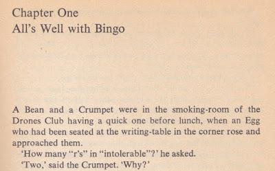
This is Ionicus's 1971 cover for the short story collection Eggs, Beans and Crumpets (1940, though for some reason this Penguin edition says it was first published in 1951). These tales of the Drones Club and elsewhere are set in Linotype Times, looking like this:
There is an amazing wealth of detail in the cover here, from the crusty buffers in the foreground, through the exuberant figure of Bingo Little bursting in with an almost audible "Vo-de-o-de-o" in the middle distance (the waiter and the page boy equally startled by the apparition) and the corners of respectable old portraits appearing at the edges (when was the Drones Club founded, for heaven's sake?), and to the beautifully detailed perspective through the double doors and the corridor to the arched window at the end. The only issue I would now take with Ionicus is that the Drones on display are in general far too elderly and respectable. There is not one of them that I would trust to chuck bread at each other at mealtimes; not with accuracy, anyway. The Drones, as everyone knows, are a lighthearted bunch, but not here.
I suspect this matter may have been discussed with Ionicus, or he may have reached the same conclusion independently. At any rate, his 1987 cover for the Uncle Fred novel Cocktail Time (1958) makes ample amends:
Here the building may be the same, but the members are more of the age and disposition you would hope and expect. But the focus, as is right and proper, is on the central figure of Uncle Fred, the fifth Earl of Ickenham, about to wang a Brazil Nut at Sir Raymond Bastable's top hat via a catapult. The composition of this is gorgeous, with an attention to detail that Ionicus was, to be honest, not always showing in his covers of this period. The yellow waistcoat, matching his shoes, that combined with the natty white suit ensures Lord Ickenham is the centre of attention; the moment of dramatic tension on every face as he takes careful aim; the anticipation of the consequences of this frivolous and irresponsible act, which will reverberate through the entire novel; it's all there.
Oh, I haven't mentioned the typeface yet: let's repair the omission. It's Plantin, slightly more extrovert than the Linotype Times used above, using stars against the chapter numbers and a large initial letter to boot:
One final thing. I don't know the law, or even the unwritten rules, of cover design, but I confess to being rather taken aback by the use later illustrators have made of Ionicus's cover design:
The same yellow waistcoat (not mentioned in the book); the same attitude with catapult, same spatial relationship with the victim; oh, but I don't need to spell it all out, for you can see for yourselves. No previous cover design was anything like it, but now they all do it. I make no accusation, you know. I just mention it.


